Community platform, redesign & system architecture · 2025
WOLOHO
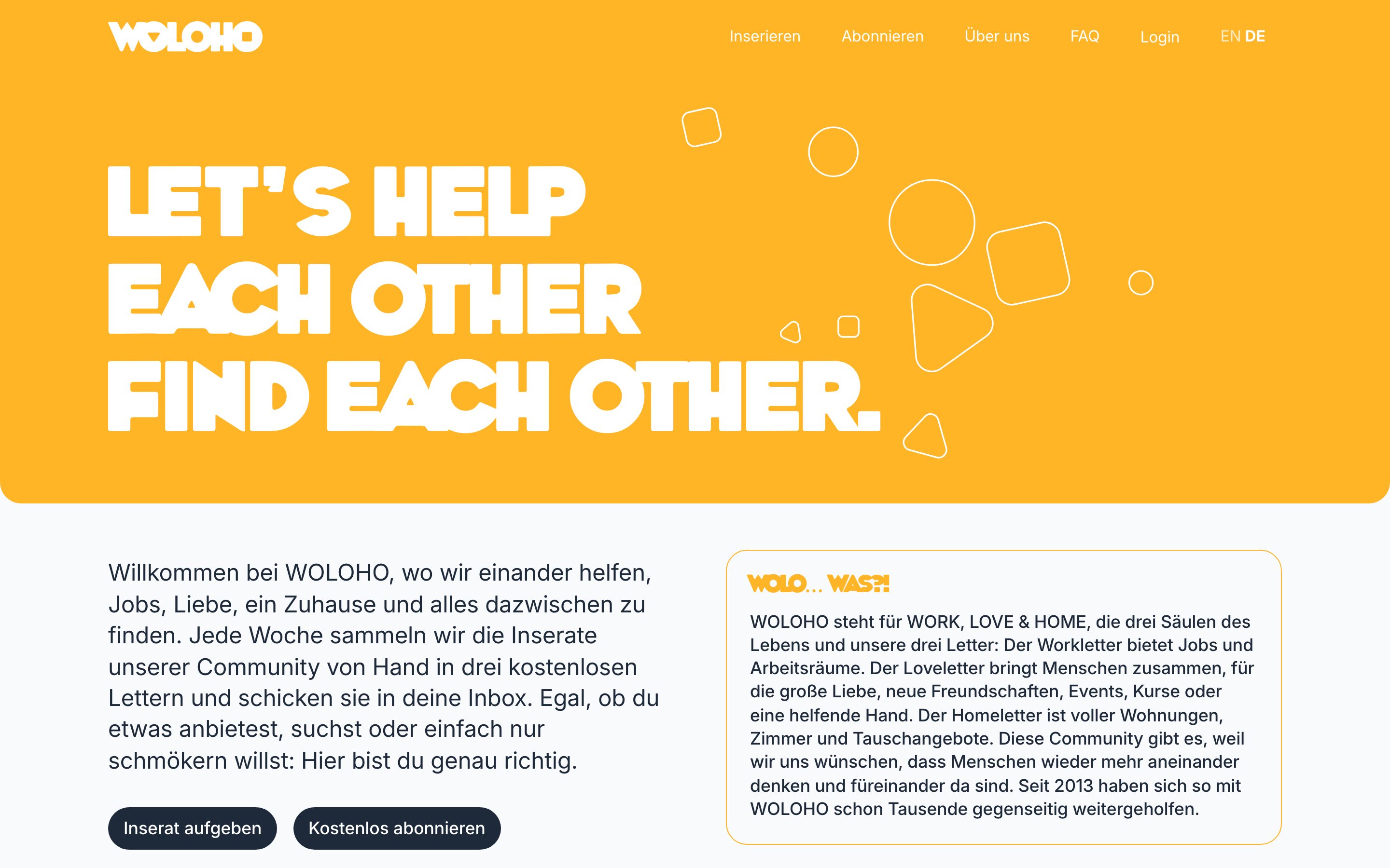
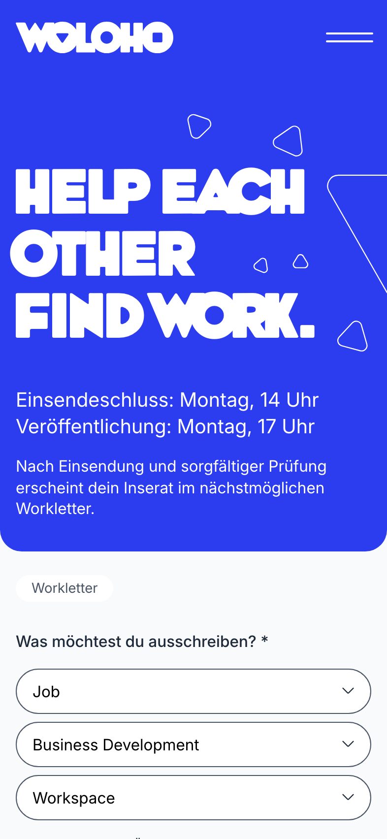
WOLOHO stands for Work, Love & Home: three hand-curated letters a week, sent from Berlin to the world since 2013. Salina Gandji designed the new concept, Konstantin Haubrok gave it its execution and structure, and together with him we did the technical implementation and rebuilt the system underneath, so that placing an ad, paying for it, moderating it and sending it out runs on one stack the small and dedicated team can operate.
- Client
- WOLOHO GmbH, Berlin
- Our role
- System architecture and engineering, implemented with Konstantin Haubrok
- Year
- 2025
- Live
- woloho.com ↗
How it was realised
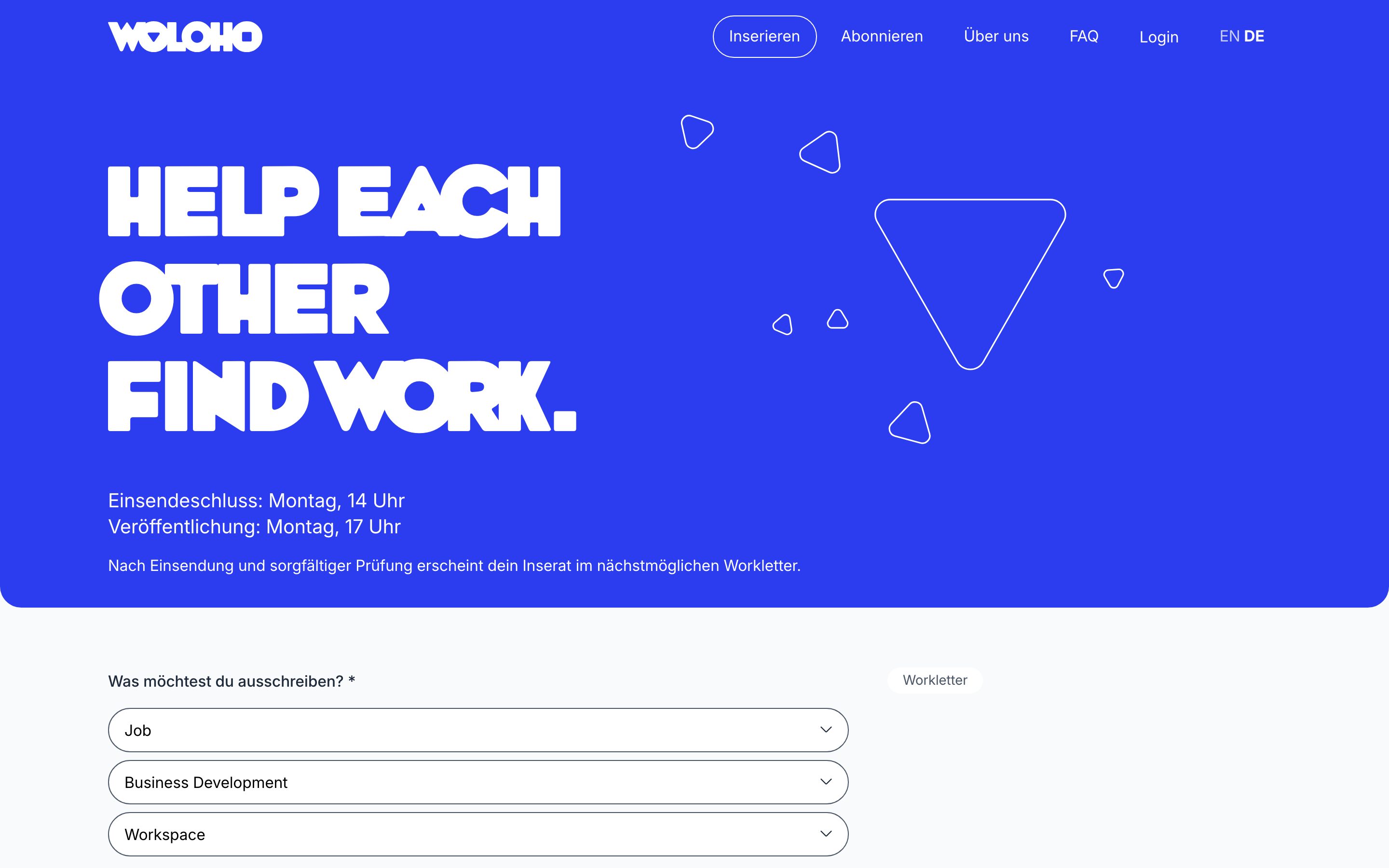
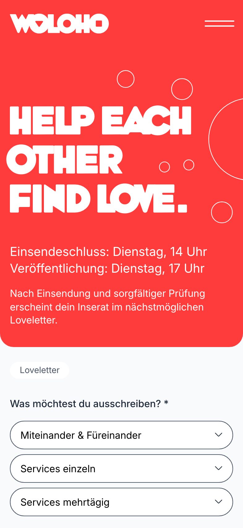
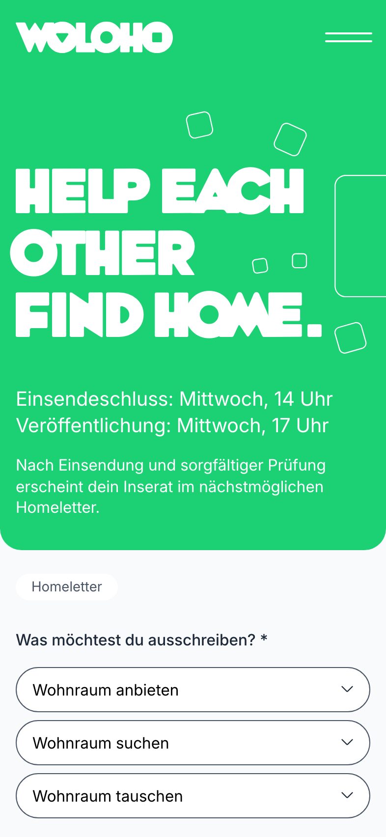
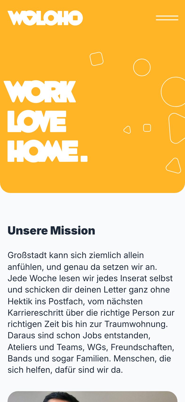
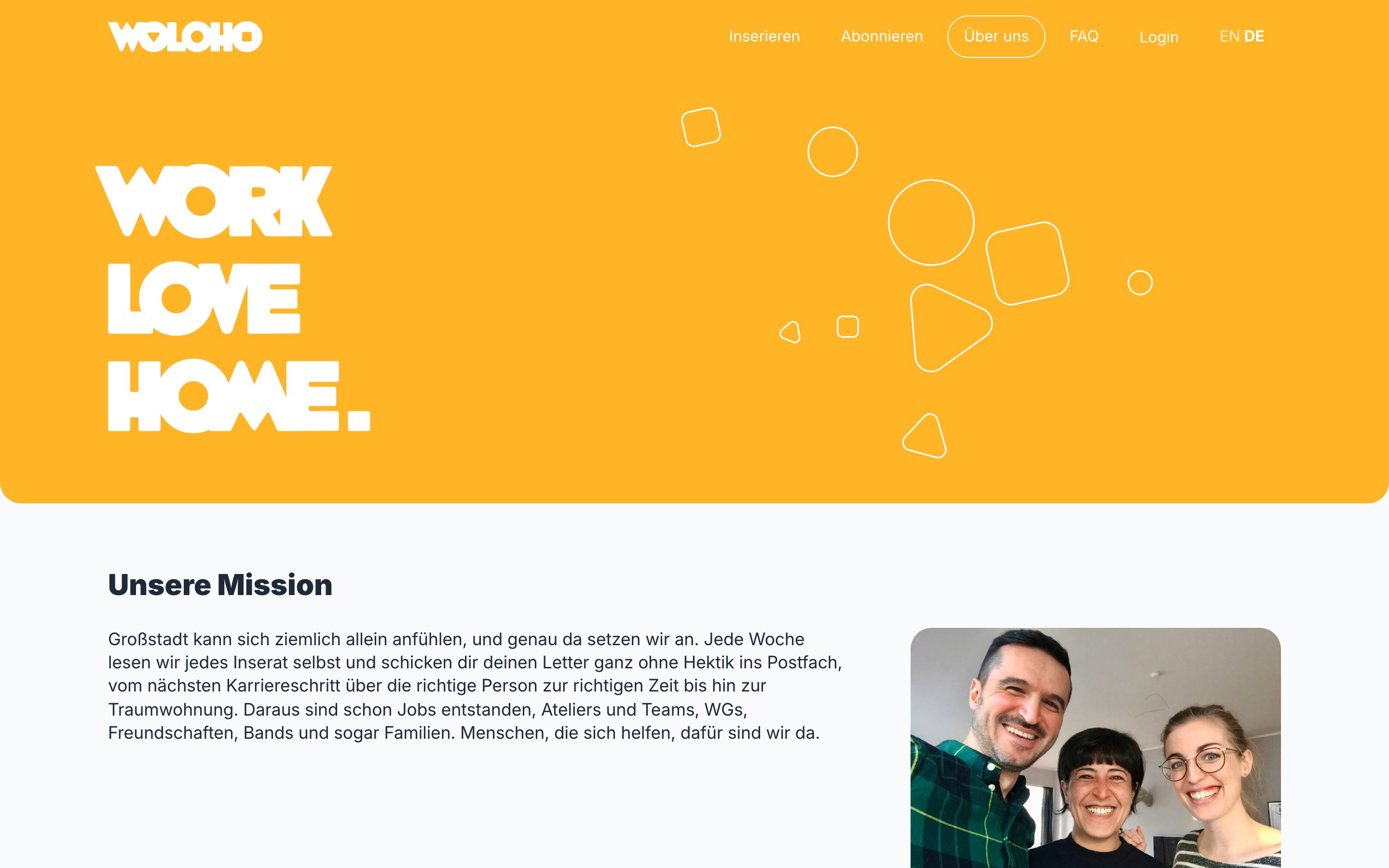
WordPress stays, but as an application: a Sage theme on Laravel Acorn with Blade templates, Tailwind and Alpine. WooCommerce became the listing engine with an "Inserat" product type of its own, account credit, EU VAT treatment with VAT-ID validation, and a checkout hardened against the ways it used to fail. WPML carries two languages across content, products and forms.
Mail is the product, so mail got engineering: transactional sending over Sweego with webhook checks and a failure log, the newsletter system wired into WooCommerce, and every letter readable on the web as well as in the inbox.
Pay-what-you-want contributions, a coupon system, two-factor sign-in for the team and a strict content security policy round it off. The team moderates by hand; everything around that hand is automated.
European infrastructure and privacy got particular attention. WOLOHO is hosted and maintained by us on servers in Germany; the letters go out through Sweego, a French provider; payments run through the European entities of Stripe and PayPal. The visitor statistics are a self-hosted Matomo without cookies and with full IP anonymisation, every font and script comes from woloho.com itself, and because only technically necessary cookies are set, the site needs no cookie banner.
What it solved
- One checkout for ads that are free in some categories and paid in others, in two languages.
- Deliverability for a weekly letter to thousands of inboxes, with failures visible to the team instead of silent.
- Keeping the editorial, hand-curated workflow while removing the manual work around it.
- European infrastructure throughout: hosted in Germany, a French mail provider, self-hosted statistics without cookies, nothing loaded from third parties, no cookie banner.
Design
Up close.
Typefaces, palette and three details.
Typefaces
WhoopAss
Headlines and the wordmark
Inter
Text and interface
Palette
- #1e2939
- #2c3cef
- #c53030
- #ffb526
- #f9fafb
Screens
In use.
Built with
WordPress · Sage · Laravel Acorn · Blade · Tailwind CSS 4 · Alpine.js · WooCommerce · WPML · ACF Pro · Advanced Forms Pro · Sweego · Stripe · PayPal · Matomo · Vite